Basic Step Of Enhance Your Visualization .
hello everyone , it's learn about
Basic Step of Enhance Your Visualization
About Visualisation :
Data visualization is the practice of translating data into visual contexts, such as a map or graph, to make data easier for the human brain to understand and to draw comprehension from. The main goal of data viewing is to make it easier to identify patterns, styles, and vendors in large data sets. The term is often used in a unique way, including information drawings, information visuals, and mathematical diagrams.
** firstly load data in jupyter notebook like
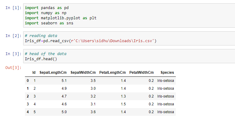
then use all visualizations codes
6 Popular Types of Data Visualizations in Python
- 1.) Bar Chart:
- 2.) Scatterplot:
- 3.) Boxplot:
- 4.) Heatmap:
- 5.) Histogram:
- 6.)bubble plot:
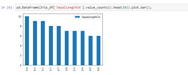
1) Bar chart
Bar charts is the most popular ways to visualize data because it presents quickly set data an understandable format that allows viewers to see height and depth at a glance. A bar chart is a graph that represents the category of data with rectangular bars with lengths and heights that is proportional to the values which they represent. It can be created using the bar() method.
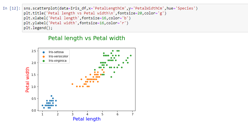
2) Scatter Plot
Scatter plots are used to observe relationships between variables and uses dots to represent the relationship between them. The scatter() method in the matplotlib library is used to draw a scatter plot.
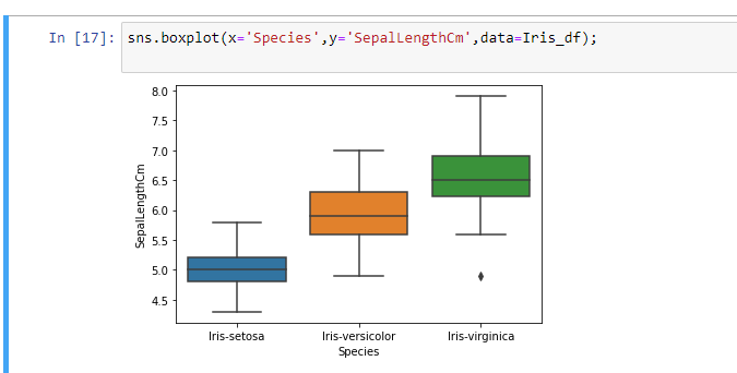
3) Boxplot
Box plot is often used for Exploratory Data Analysis to get a statistical view of a given dataframe. It also helps us to observe the skewness, distribution and outliers of a data too. We are going to see how to plot Vertical and Horizontal box plot in Python.
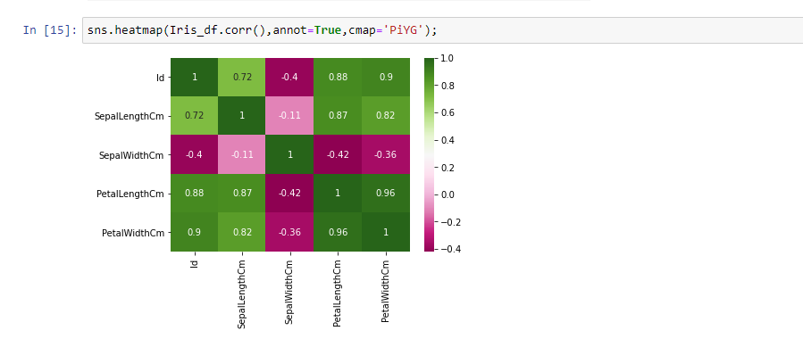
4) Heatmap
Temperature maps represent individual values from a set of data in the matrix using color variation or color intensity. They often use color to help viewers compare and contrast data at two distinct categories. They are useful for viewing web pages, where the areas most users encounter are represented by “hot” colors, and pages that receive the fewest clicks are displayed in “cold” colors.
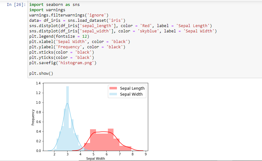
5) Histogram
A histogram is basically used to represent data in the form of some groups. It is a type of bar plot where the X-axis represents the bin ranges while the Y-axis gives information about frequency. The hist() function is used to compute and create a histogram. In histogram, if we pass categorical data then it will automatically compute the frequency of that data i.e. how often each value occurred.
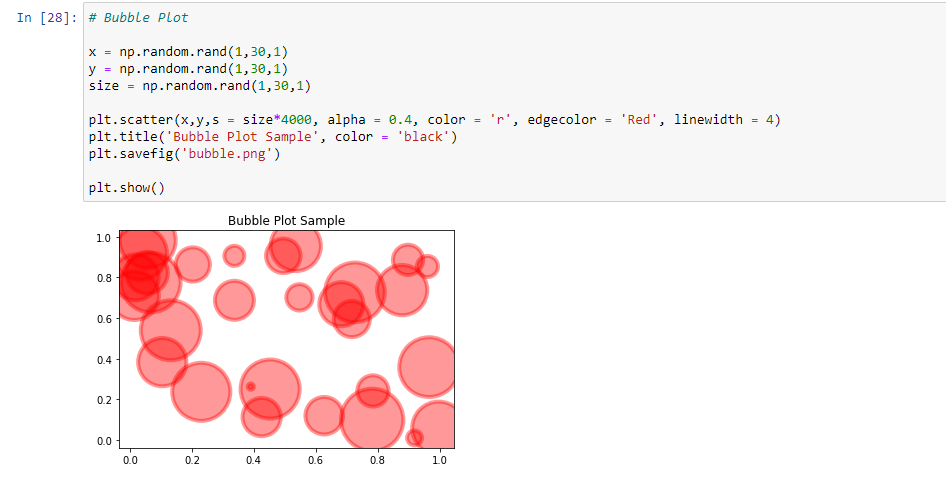
6) bubble plot
A bubble plot is a scatterplot where the circle size is mapped to the value of a third numeric variable. This section shows many bubble plots made with Python , using both the Matplotlib and Seaborn libraries.
Conclusion:
dataset with the help of the four different plotting modules of Python namely Matplotlib, Seaborn, Bokeh, and Plotly. We just covered some of the basic visuals in python and there are much more than you think of like Geospatial visualizations, Networks, Sankey diagram and the list goes on and on.
I hope you liked this.
Thank you,
Happy Learning!
- Sidhesh Tonape
- Jun, 21 2022