How to choose correct visualization for your data?
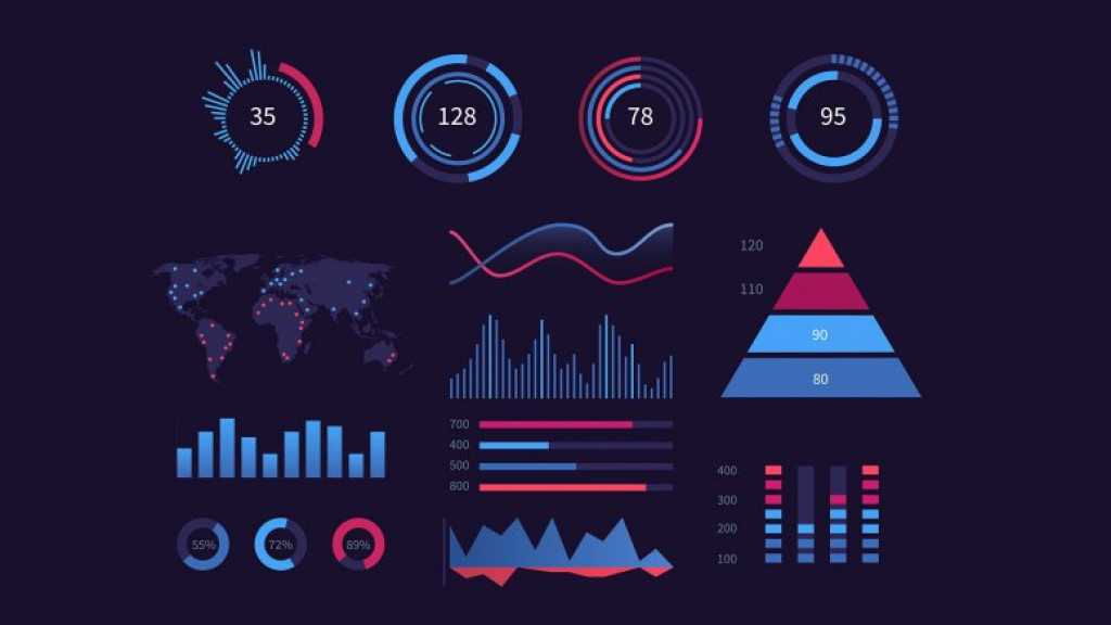
What is Data Visualization?
Data
Visualization allows you to understand your data in a better way which is easy
to understand. It is all about representing your data in a visual manner
through various types of charts, maps. Diagrams, etc. It can help to give
proper significance to your data.
How Data Visualization work?
Data is
usually in raw format. Just by watching numbers you won't understand anything.
But a proper visual format will help people to extract meaning from that data
and can be able to get quick information.
Data
Visualizations allows you to expose patterns, trends, and correlations that may
otherwise go undetected, too.
Best Practices for Data Visualizations
While
determining how you will visualize your data, some of the best practices you
have to keep in your mind are –
- Choose
the visual which fits best for your data and it’s purpose.
- Ensure
your visual is easily understandable and viewable.
- Make
proper context arrangement with your visual so that everyone can
understand.
Questions to ask before deciding any visual for
your data
Many
times we don't know which visual is to be selected for what purpose. So this
are some of the questions one can ask before selecting the proper visualization
for their data.
Do you
want to compare values?
When you want to compare the values of various columns of your data set you can use comparison chart visualizations. The can easily show the high and low trend in the data values.Some of the visualization chart you can choose are -
- Column
- Line
- Mekko
- Bar
- Scatter
- Pie
Do want
to represent the composition of something in the data?
Many visuals can show up how a individual category make up the whole of something. For example, total sales done by sales representative.
Some of
the charts favouring this category are -
- Stacked Bar
- Stacked Column
- Area
- Waterfall
- Mekko
- Pie
Do you
want to understand how your data is distributed?
Distribution charts can represent the distribution among the data and the range of information in your values.
Some of
this charts are -
- Scatter Plot
- Line
- Column
- Bar
When you
want to know the trends in your data set?
If you want to represent the time series data or want to know the information about a specific time period you can use the following charts.
- Line
- Dual - Axis Line
- Column
When you
want to better understand the relationship between the value sets?
Relationship charts are suited to show how one variable related to other multiple variables. You can show positive relationship or negative relationship on another variable.You can use the following charts to find the relationship between variables -
- Scatter plot
- Bubble chart
- Line chart
In the
next article we will understand the dive deep into the theoretical part of each
of the visualization and then into code.
Happy
Learning!
- Jay Charole
- Mar, 10 2022