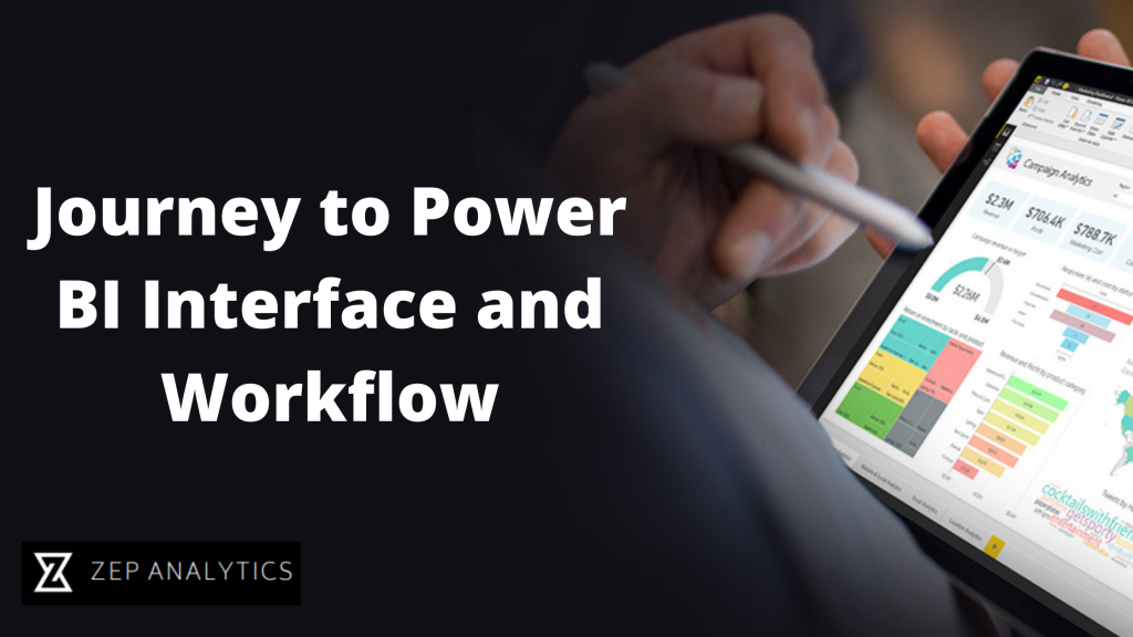
Journey to Power BI Interface and Workflow
Hello Everyone,
We are back with another blog on Power BI and this is an interesting one.
So before starting with Power BI it’s important that we understand the User Interface of Power BI and how various components of Power BI work. So in this blog, we are going to study the Power BI UI and its workflow. So let’s start.
So when you open up a power be it desktop file and it looks something like this.

We’re going to dive into each of the specific menus and pains and options here as we move further.
But what’s important to pay attention to now is this set of three icons on the left side of the screen.

These are three or three core views that represent the entire power of the universe. You’ve got a report view, data view and relationships view.
Now when we think about the power BI and broad business intelligence workflow it actually doesn’t really follow this order. We don’t start with the report and then move into data and relationships. We’re going to follow kind of a different process.

Instead, we’re going to start with the data view and the query editor. This is where we’re going to connect (data) shape and transform that raw data. Once we have our data we’re going to shift gears into the relationships view that’s where we’re going to actually design our data model and tie those tables together with relationships and from there we’ll move into the third phase which is actually designing interactive reports and visualizations and all that’s going to take place in the Reports tab.
So we will be bouncing around quite a bit between all of these different views. But generally speaking, this is how things are going to flow.
So let me show power BI, just want to give you a very quick preview of how these different views and tabs look and feel.
So here we are on the power BI desktop as you can see on the left we’ve got our three familiar icons to report data and relationships.
Right now I’m in my report view which is basically my canvas for creating dashboards. I can drag visualizations and objects can access my fields and measures here but this is where all of the designing takes place.

Clicking through to the Data tab is where you can actually see the tables and the raw data and fields that you’re working with. So you can click through to see different previews of your tables. You can also add your calculated columns and measures using data analysis expressions here as well.

And then you’ve got your relationships view which is all about the data model. This is where you can see your tables as objects. Along with the relationships the cardinality of the filter flow. Everything about your model.

That’s your complete overview of the power of the desktop interface and workflow.
So here we have observed lots of things and now I think we are good to go with the practical aspects of Power BI. Meet you all in the next blog.
Thank you!
Happy Learning!
- ZA Admin
- Sep, 19 2022