
Timeseries analysis of India's GDP using Rstudio.
Timeseries analysis of India’s GDP in R
Getting Time series data: -

Year is starting from 1960 and ending with 2021 with 62 observations.
Now we need to convert the dataset into timeseries data.

Is my time-series Stationary?
There are two Steps: -
- Plot the Data
- Test your Assumptions
- Plotting the Data: -
It is Very important and valuable to check the data and get more familiar with it before starting any analysis. You will find easier to spot data quality issues or outliers that should be remove or analyzed separately if you spend some time looking at the data.

- Testing Assumption: -
You might not be able to see directly that data is stationary or non-stationary. In this situation, it’s very hard to tell!
For that, Dickey-Fuller Test can help us. it is Unit root test. Where,
Null Hypothesis(H0): - The Series is not Stationary.
Alternative Hypothesis(H1): -The Series is Stationary.
Like any other statistical test, we’re going to reject the Null Hypothesis if P-value is less or equal to the significance level, which is 1%,5% or 10%. Let’s take 1% significance level, such that we reject or accept the Null Hypothesis with 99% confidence.
For our time-series to be stationary, the p-value has to be ≤ 0.01.

Here, our p-value is 0.99 which is ≥ 0.01.
So, we must use transformation on GDP data and perform the Dickey-Fuller test again. A common transformation used in mathematics, which is used because it doesn’t impact the properties of the data, is the log-transformation. This means we will compute the Logarithm of each data point in the timeseries.
Testing Time-series is stationary or not, after log-transformation using Dickey-Fuller Test.

Here, our p-value is 0.5384 which is ≥ 0.01.
We are still not getting stationary data.
Our Timeseries is still not Stationary: -
We tested the original data as well as transformed data, but our timeseries data is still not stationary.
We have still other have to get stationary data by other techniques that transform the data without changing its properties.
- Differencing
- Decomposition
Differencing: - Differencing is Subtracting each data points from the data point before it, i.e., Differencing consecutive values.
Decomposition: - this technique is going to isolate each component of the time-series that was mentioned at the beginning (trend, seasonality, cycle, irregularity) and provide the residuals.
In our case, we are going to try differencing the dataset.
Again, applying Dickey-Fuller test,

Here, our p-value is 0.1882, which is ≥ 0.01.
Taking again second differencing and again, applying Dickey-Fuller test,

P-value is ≤ 0.01. the timeseries data is stationary.

Let’s Take look at the Stationary timeseries after second differencing.
Time series modeling: -
There are many models of time series, the most popular are:
- Simple moving average: -
With this approach, you’re saying the forecast is based on the average of the n previous data points.
- Exponential Smoothing: -
It exponentially decreases the weight of previous observations; such that increasingly older data points have less impact in the forecast.
- ARIMA: Auto-regressive Integrated Moving Average: -
This is the approach we’re going to use.
The ARIMA model can be broken down into three different components, each one with a parameter representing the characteristics of the time series.
1. Auto-regressive: AR(p)
Auto-regressive models explain random processes as linear combinations, such that the output variable depends linearly on its previous values and a random variable.
In short, it’s a model based on prior values or lags.
If we’re predicting the future GDP of India, the AR model will make that forecast, or prediction, based on the previous Year’s GDP.
If we look at the math, we can describe the AR(p) model with parameter p:

The parameter p indicates the number of autoregressive terms, as in, the number of terms in your linear combination.
2. Integrated: I(d)
The name is misleading, but this has to do with how many times the dataset was differenced, which is indicated by the value of parameter d.
3. Moving Average: MA (q)
Similar to auto-regressive models, in moving-average models the output variable is explained linearly, but this time is an average of the past errors.

Putting it all together, the formula for the ARIMA (p, d,q) looks like this.

Picking parameters for ARIMA (p, d, q):-
We already know that we had converted second differencing the data, so the value of parameter d is 2.
But we still need to figure out the values of p and q. And for that we are going to look for autocorrelation, AR(p), and moving average, MA(q), profiles.
Autocorrelation (AR) profile: -
This is done by testing the correlation between the data points in the time series with themselves at different lags, i.e., at points in time.
For that, we’ll use the Autocorrelation Function plot, ACF plot for short.
With the ACF plot, we can spot the autocorrelation (AR) profile when
- ACF data points are sinusoidal or exponentially decaying
- PACF has a spike, or a few consecutive spikes, and cuts off sharply after
Moving Average (MA) profile: -
To determine the moving average profile we’ll use a subset of ACF, the Partial Autocorrelation Function plot, usually referred to as PACF plot.
PACF represents the autocorrelation at different lags, but it removes the lower-order correlations, i.e., all the correlations between 1 and lag-1, because everything in between is going to be inherently correlated.
With the ACF plot we can spot the autocorrelation (AR) profile when we see the reverse of what was described for the AR profile:
- PACF data points are sinusoidal or exponentially decaying
- ACF has a spike, or a few consecutive spikes, and cuts off sharply after
On top of this, the spikes in the plot must be statistically significant, meaning they are outside the area of the confidence interval. This confidence band is either represented by horizontal lines or an area like in an area chart, depending on the software you use.
Let’s look at ACF and PACF plots side by side.
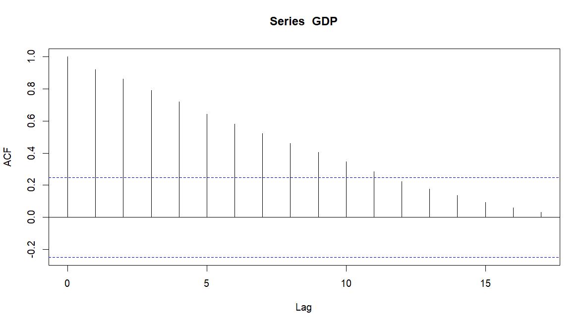

Analyzing the ACF plot, we can see that graph is continuously decreasing pattern, so we will assume that AR (0).
As for the PACF plot we can see the first spike at lag=1, so we will pick MA (1).
We have our model, ARIMA (0,2,1)


AIC & BIC will help us to choose the best time series model.
Ljung-Box test: -

no significant difference was observed that indicates there are no auto-correlation problem.
Residual Plot: -

Most of values re concentrated at 0 and look normal distributed, same indicates there is no series problem with existing model.
Forecast: -


Conclusion: -
Form forecast table, India’s GDP of Year 2022 is $3206.99 B with 95% Confidence Interval (3031.358 , 3382.622) & in 2023, India’s GDP is is $3351.596 B with 95% Confidence Interval (3132.996 , 3570.197).
- Dhruv Patel
- Dec, 27 2022