
Tips to work with Map Visuals
Introduction:-
Map Visuals is a part of Data Visualization.
Data visualization is the graphical representation of information and data. By using visual elements like charts, graphs, and maps, data visualization tools provide an accessible way to see and understand trends, outliers, and patterns in data.
The main goal of data visualization is effectively, efficiently, elegantly, accurately as well as meaningfully communicating information.
What is Map Visualization?
Map visualization is used to analyze and display the geographically related data and present it in the form of maps.
This kind of data expression is clearer and more intuitive. We can visually see the distribution or proportion of data in each region.
Famous Tools used for creating Map Visuals :-
- Power BI
- Tableau
Soo here we are going to use the tool Power BI which is an app from Microsoft.
Power BI has two different types of map visualization :-
- A bubble map that places a bubble over a geographic point.
- A filled map that actually shows the outline of area you want to visualize.
Information required to create maps in Power BI :-
- Power BI is flexible about what type of location value it accepts, from more general details like city name or pin code, down to very specific latitude and longitude data.
- Add a field to the Values bucket to change the size of the bubble accordingly for each map location.
- When you create a map visualization in Power BI service or Power BI Desktop, the data in the Location, Latitude, and Longitude buckets that is being used to create that visualization is sent to Microsoft Bing.
There are three types of maps given in Power BI for map visualization :-
- Normal Map
- Filled Map
- ArcGIS Map
Soo here we are going see How to create Map Visualization in Power BI :-
- Go to Home >> Enter Data.

2. Here, we can create our own Data & also we can load data from different sources.
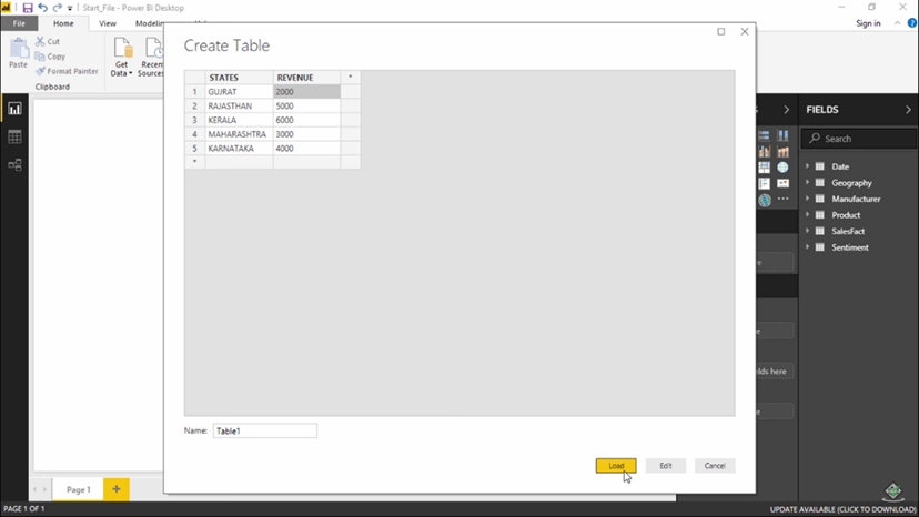
3. So after giving the data, the table which we created goes to the Fields tab to the right.

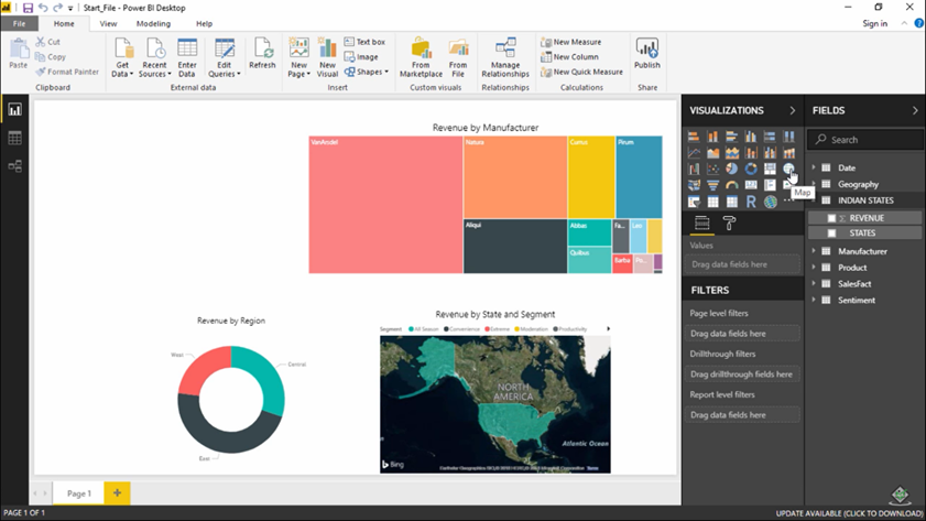
4. So let’s start to create a map visual. Go to Visualizations >> Search for Map.

5. Soo this 2nd type of map:- Filled Map.

6. Soo this is 3rd type of map :- ArcGIS Map.

So, we have created 3 types of Map Visualizations with the help of Power BI.
Now, lets see How to optimize these map visuals.
- Categorize geographic fields in Power BI Desktop: In Data view, select the desired column. From the ribbon, select the Modelling tab and then set the Data Category to Address, City, Continent, Country/Region, County, Postal Code, State, or Province. These data categories help Bing correctly encode the data.
2.Use more than one location column.: If your data doesn't contain enough location data, add those columns and categorize them appropriately. For example, if you only have a City column, Bing may have a hard time geo-coding. Add other geo columns to make the location unambiguous. Sometimes all it takes is adding one more location column to the dataset - in this case state/province.
3. Use specific Latitude and Longitude.: Add latitude and longitude values to your dataset. This removes any ambiguity and returns results more quickly. Latitude and Longitude fields must be in Decimal Number format, which you can set in the data model.
4. Use Place category for columns with full location information.: While we encourage you to use geo-hierarchies in your maps, if you must use a single location column with full geographical information, you can set the data categorization to Place.
- Shreyash Tare
- Jun, 20 2022